This mental health packet was a collection of general information on common mental health issues as well as techniques to improve one's own mental health. The client had plans to apply for NHS funding and become an official product designed to assist people waiting for therapy, as well as using the material privately.
The Project began with exploring ways in which we could represent human characters with flaws without coming across as condemnatory. Further, the characters needed to represent anyone that might be engaging with the content.

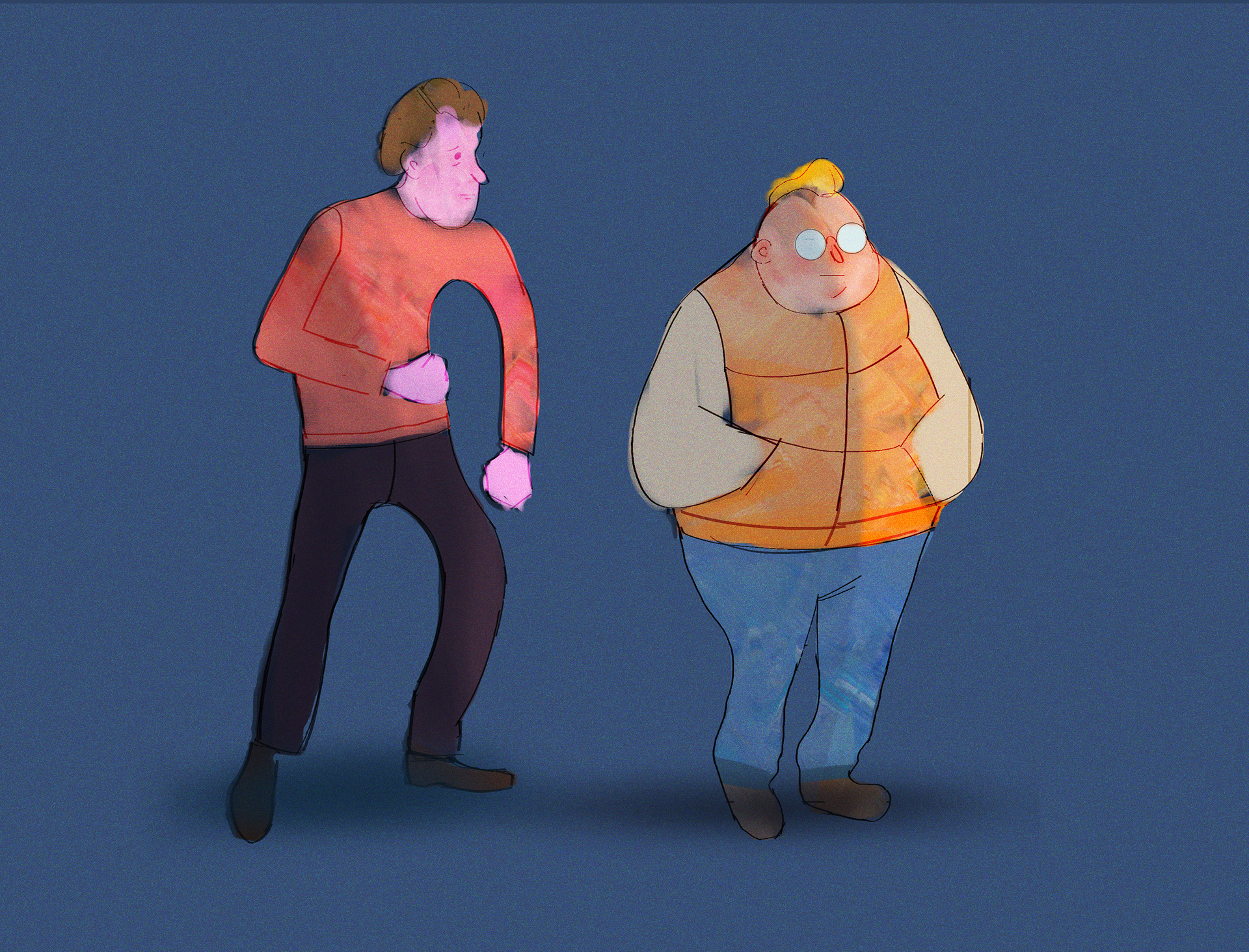
These first explorations didn't really work. These designs feel like specific, idividual, characters rather than an avatar for any given consumer of the material.
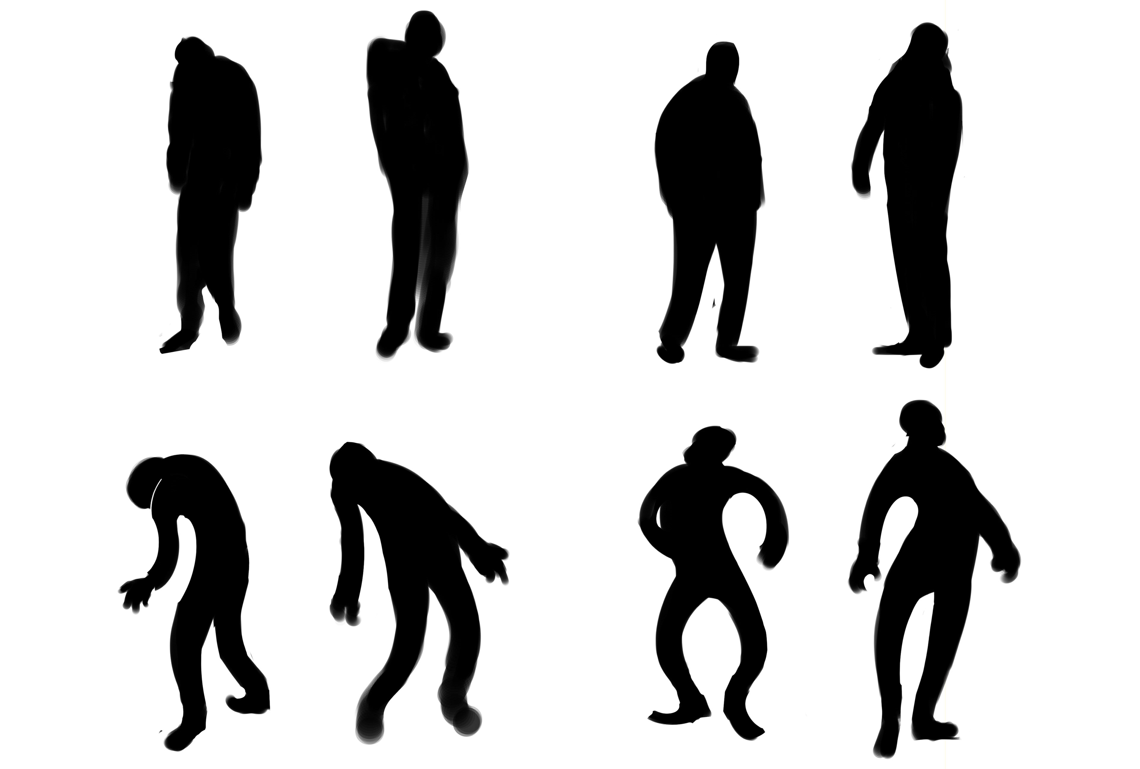
I started fresh with a series of silhouettes.
I focused on silhouette because I was looking to remove superfluous detail, a quality that's intrinsically absent in silhouette. I could simply focus on creating shapes that felt happy or sad and not worry about the detail.
As seen above, I began with understated human silhouettes and then exaggerated them.
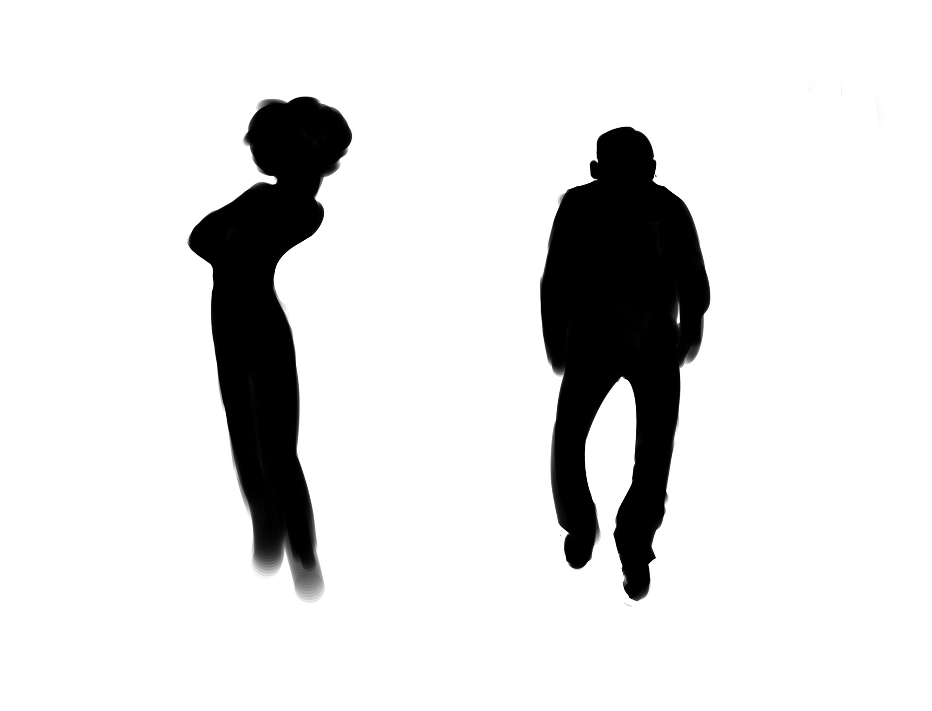
I experimented with including specific details, like hairstyles and clothing, but it again pushed the designs too much toward specific, individual, characters.
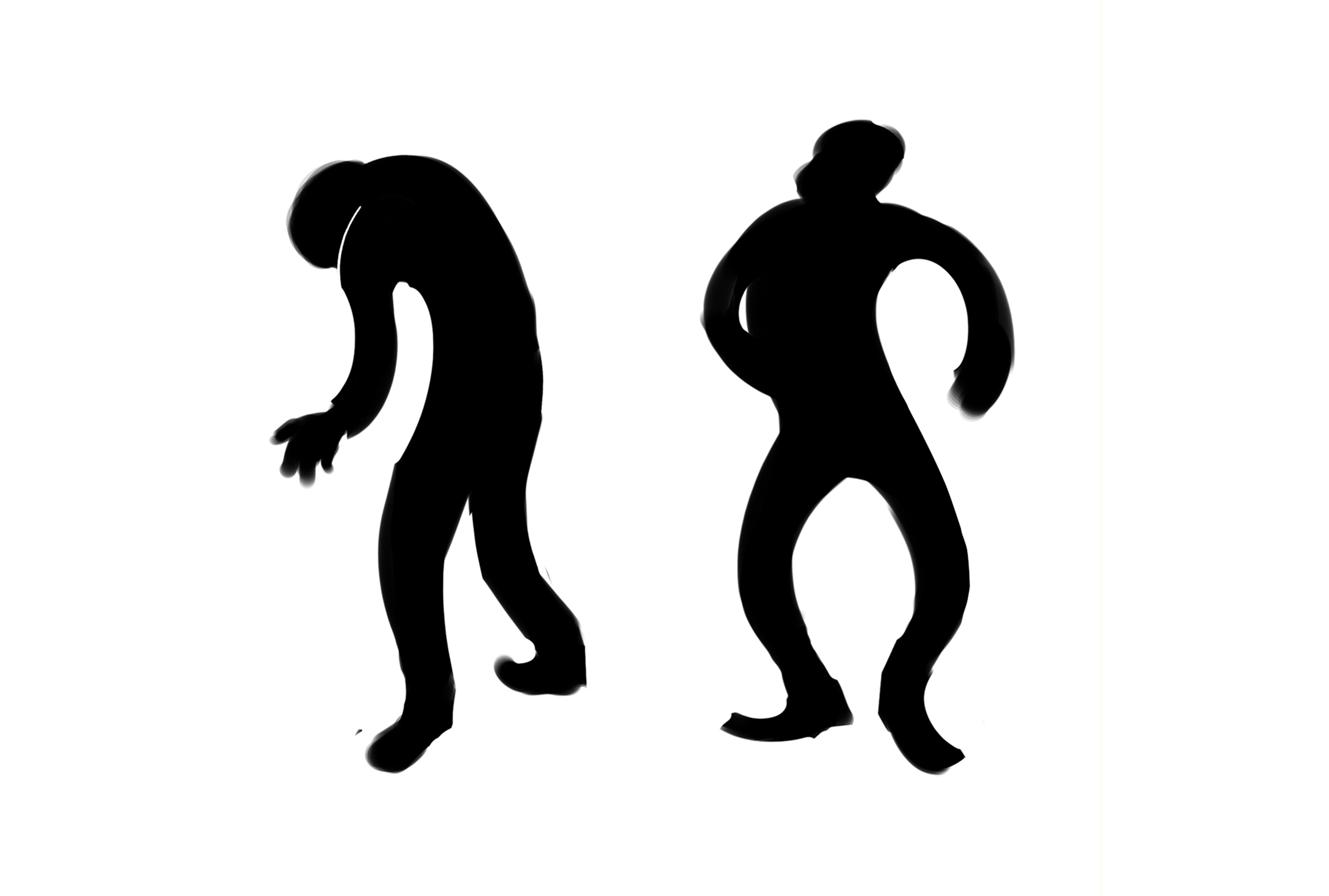
As such I decided to move forward with the drawings on the left.
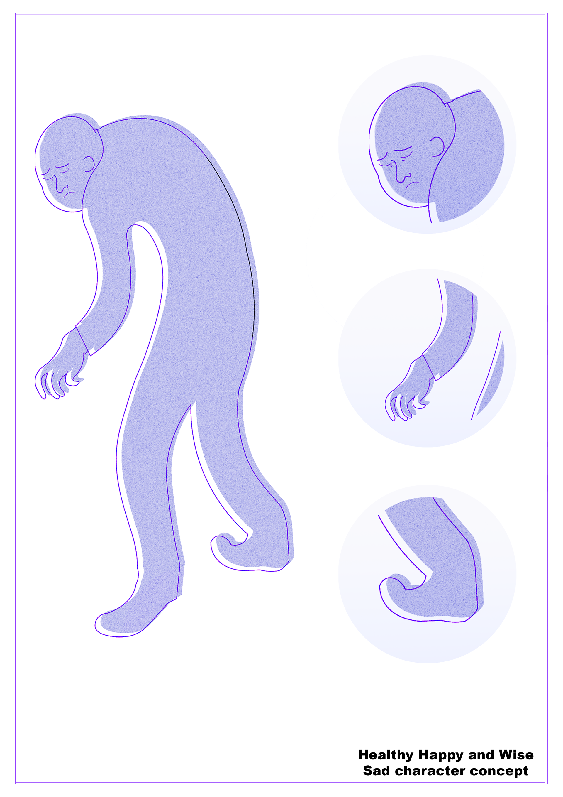

The end result is effectively still a silhouette.
The linework's main function here is to provide detail in the face; it doesn't deviate from the silhouette anywhere else, it simply outlines it. As such, the designs retain all of the benefits of a silhouette: the characters don't feel like specific individuals. Rather, they work as emblems for their respective emotions and remain applicable.
The decision to offset the silhouette from the linework is not one that I actively considered, it just felt right. In retrospect, it works well as an analogy for the complicated, somewhat disconnected, relationship between body and mind that is central to the topic of mental health.
All in all I feel that the illustrations satisfy the brief and work well.
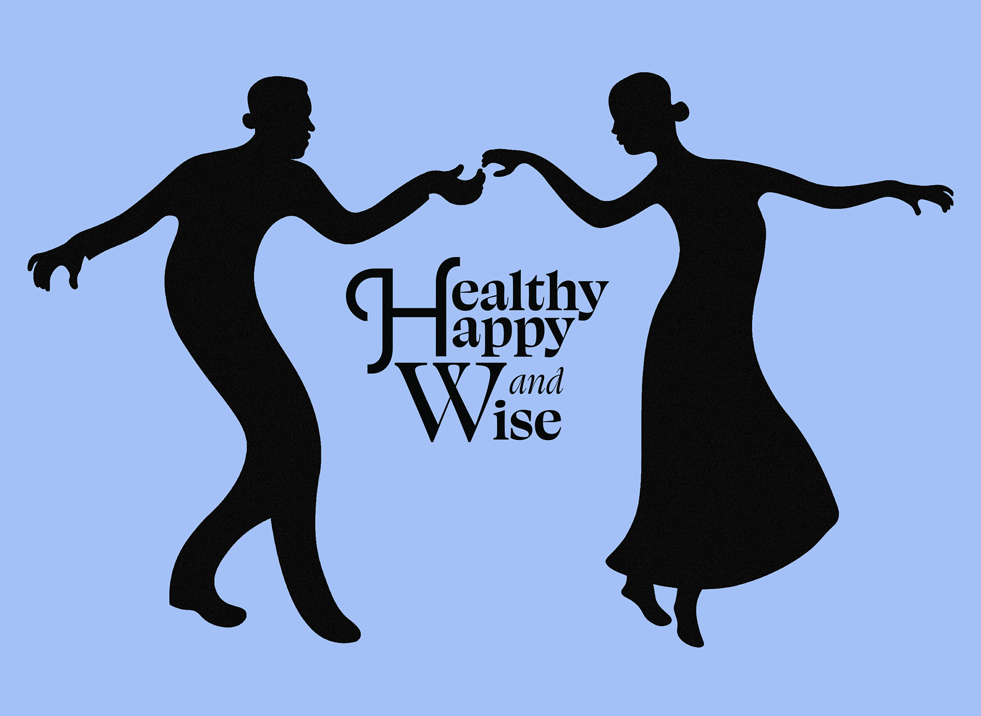
A logo for the project
The client requested an image of two dancers (male and female) for use as a logo for the project.
I applied the same design logic to this image and focused on creating silhouettes that were emblematic of calmness. The figures' effortless poses represent the quiet calm that comes with improving one's mental health.
Unfortunately the client shelved the project at this point.