Nick has a distinct,unique, visual language. As such, the main challenge of this project was mainting his style throughout the process of ammending linework and eventually adding colour.

Nick's pencil drawing .
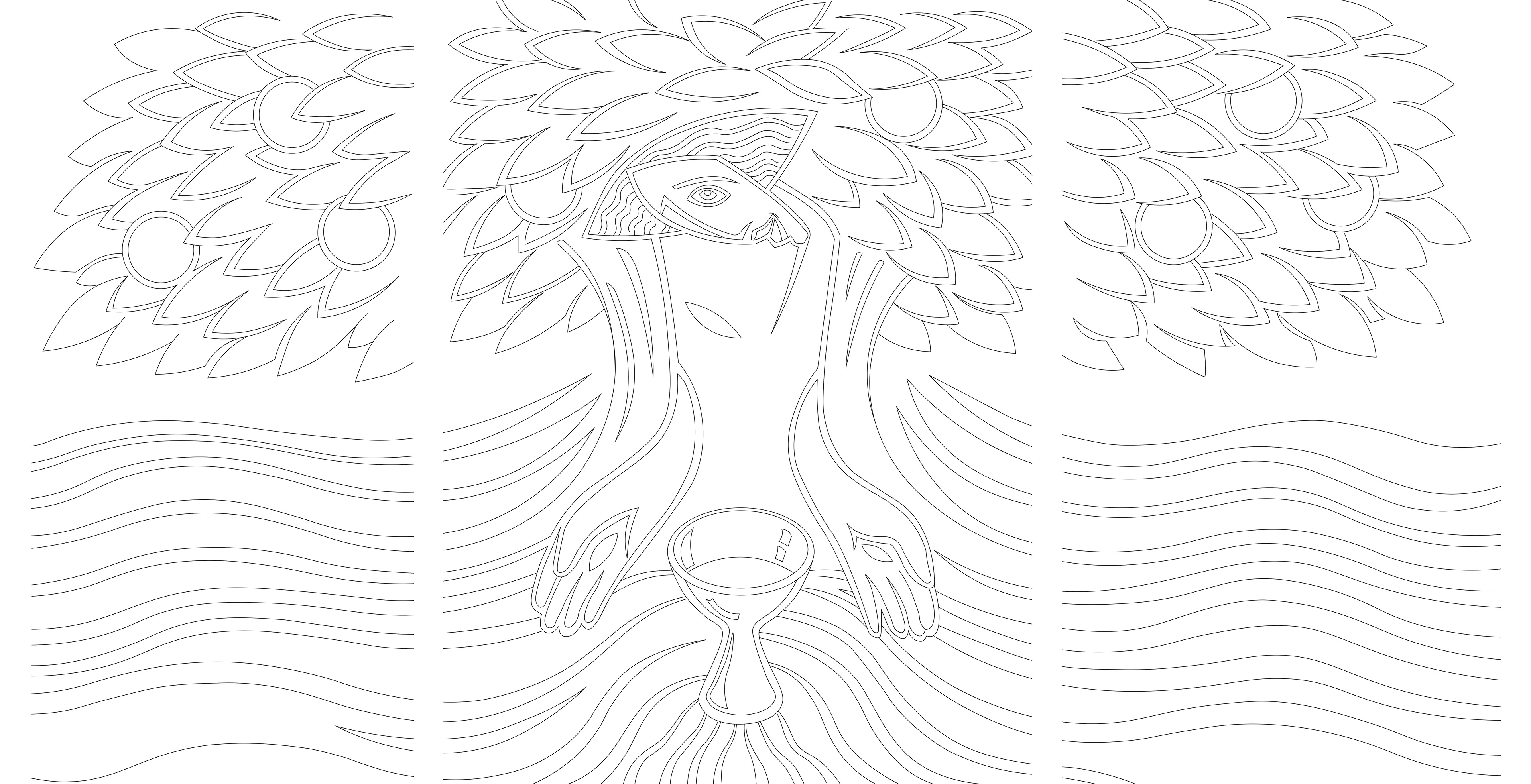
My finalised digital linework.
The process of digitising Nick's original linework involved a few challanges.
I worked meticulously to ensure that the lines connected across the panels, and that key features were perfectly straight and/ or symmetrical. As a result, I ended up making structural changes to the drawing that affected it as a whole. This then involved going back through the image and making slight adjustments to recapture the flow and feeling of the original image.
Although we eventually decided to omit this linework in favour negative space, all of this work denotes placement.
In the end we arrived at a result that felt distinctly like Nick's work.
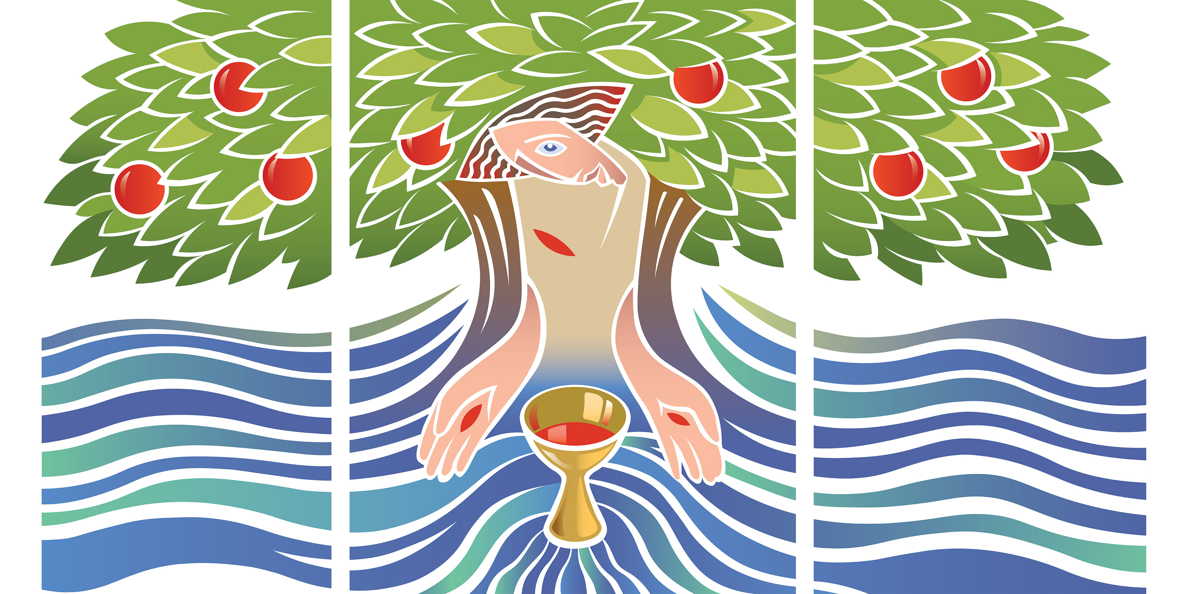
The final coloured image.
Colouring the image involved me doing an intial pass and then working to feedback from Nick. The back and forth led to striking visual decisions that wouldn't have come to being without that collaberation.
For instance, the hints of green from the tree in the water, and the ubiquitous shade of red that denotes, wine, wound, fruit, and hair. These really decisions elevate the piece.
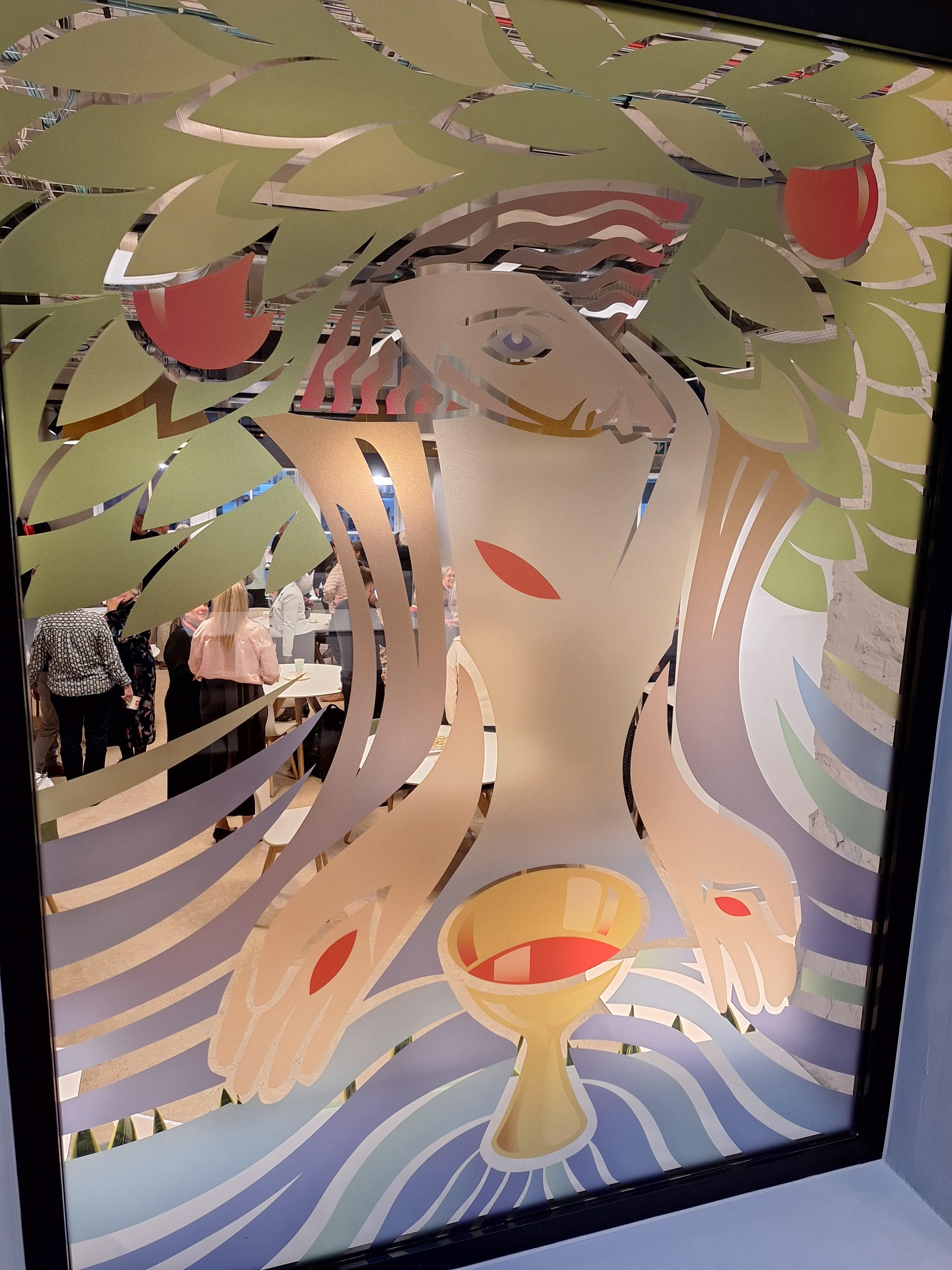
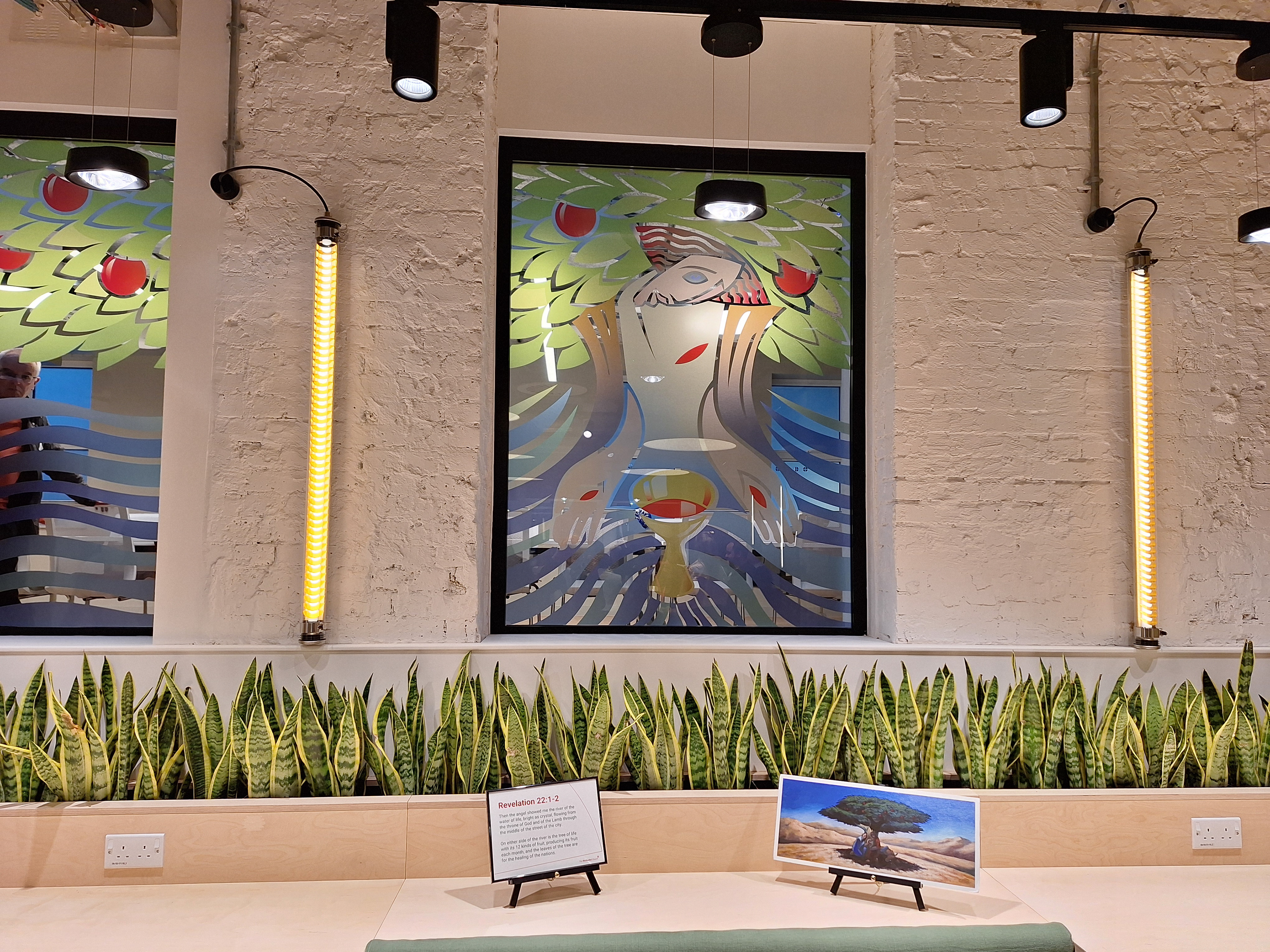
The windows in situ.
All in all the design was very successful. In particular, using clear glass for the negative space (in lieu of linework) works exceptionally well in the space.