Work
Illustration
Art
Contact
Work
Illustration
Art
Contact
You may also like
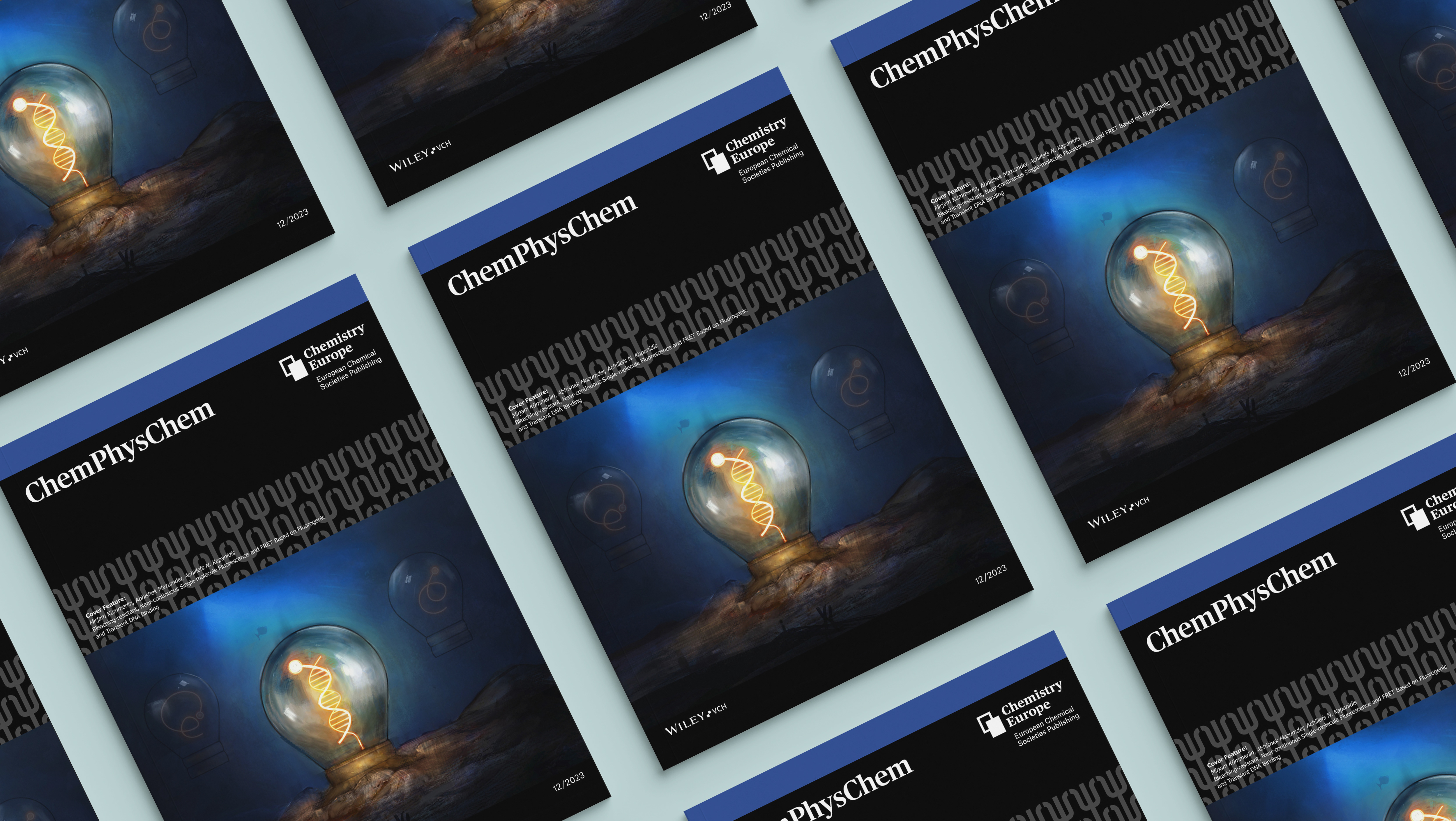
ChemPhysChem Cover
2026
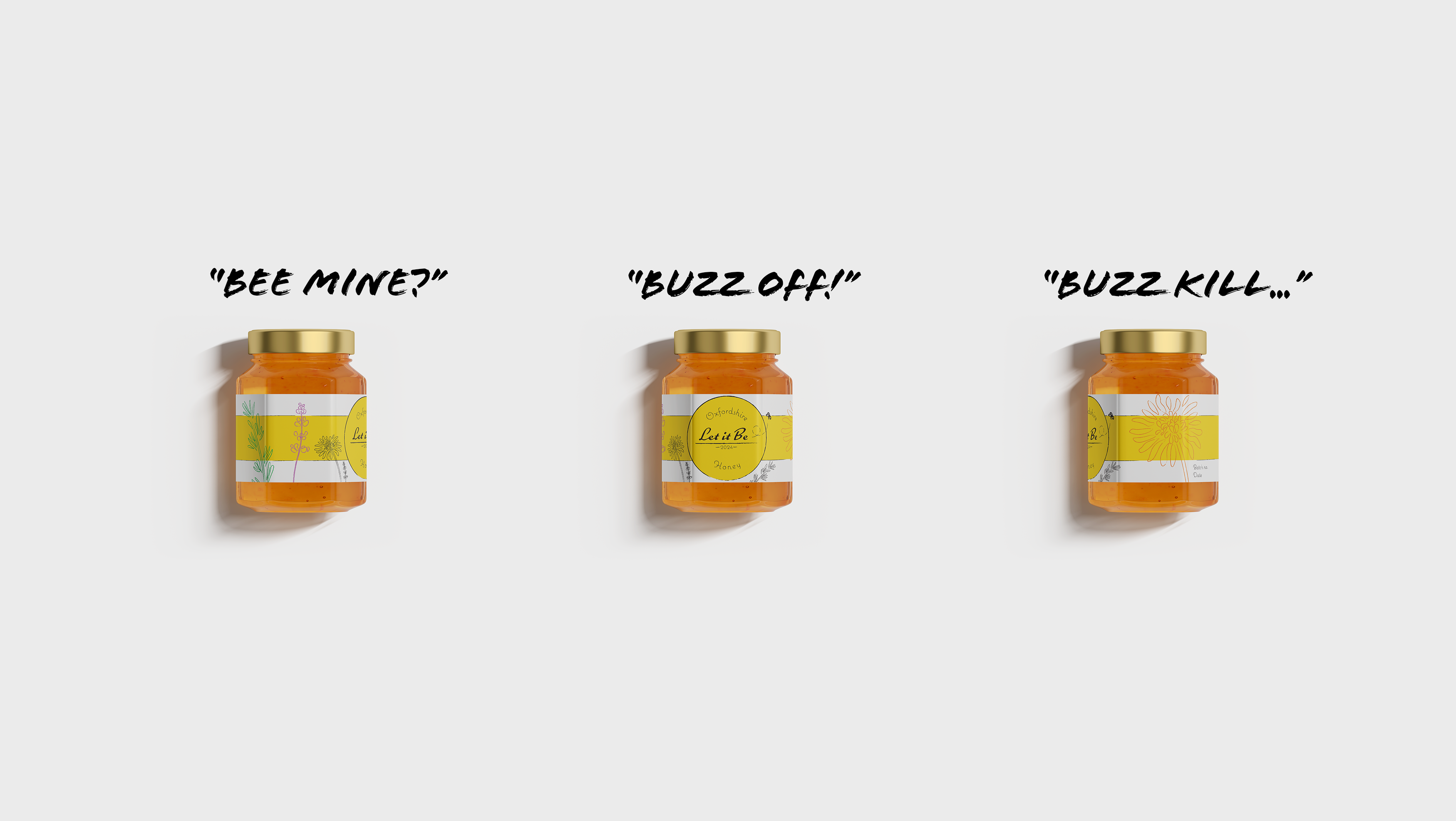
Let it Be
2025
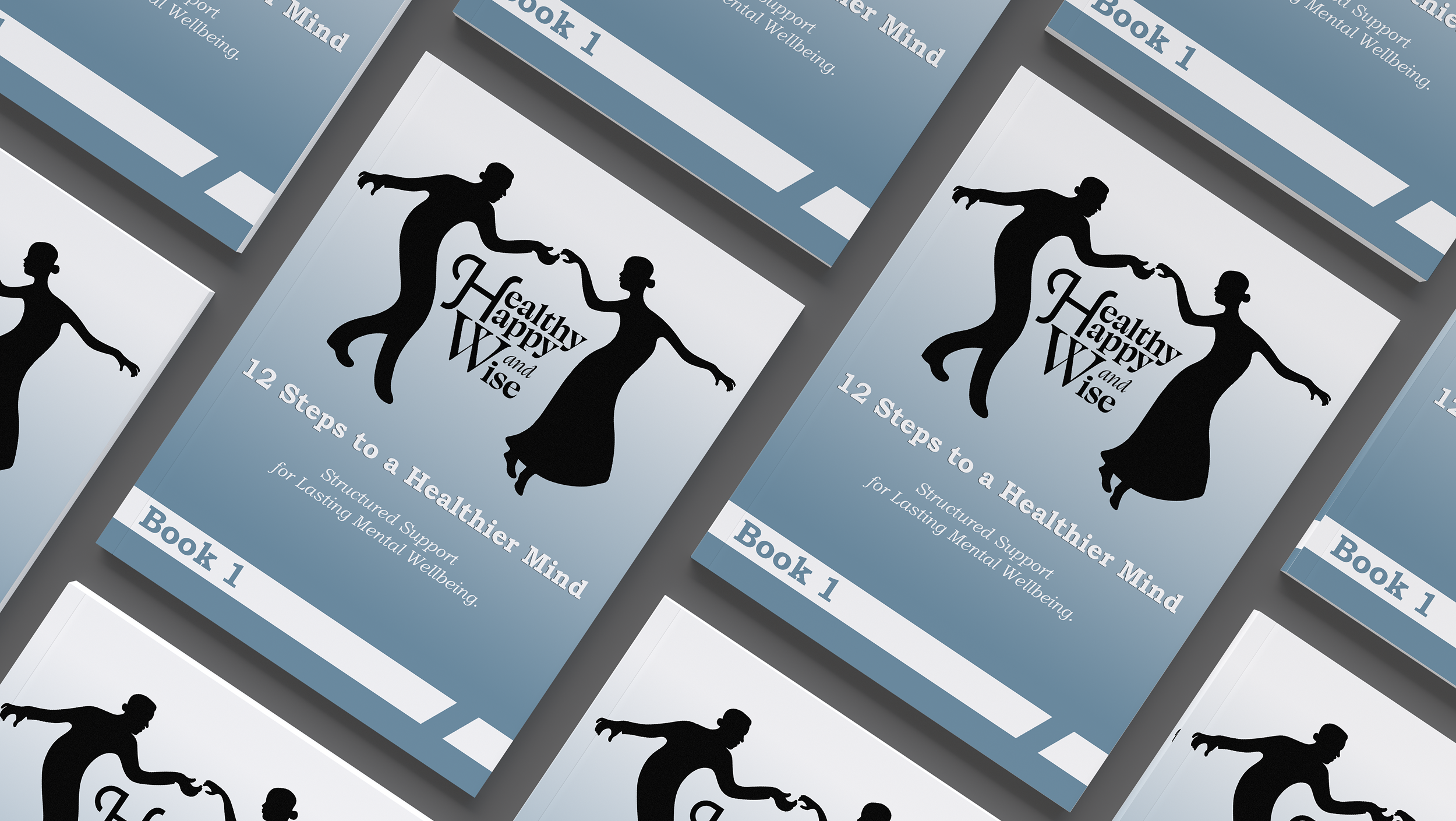
Healthy Happy and Wise
2025
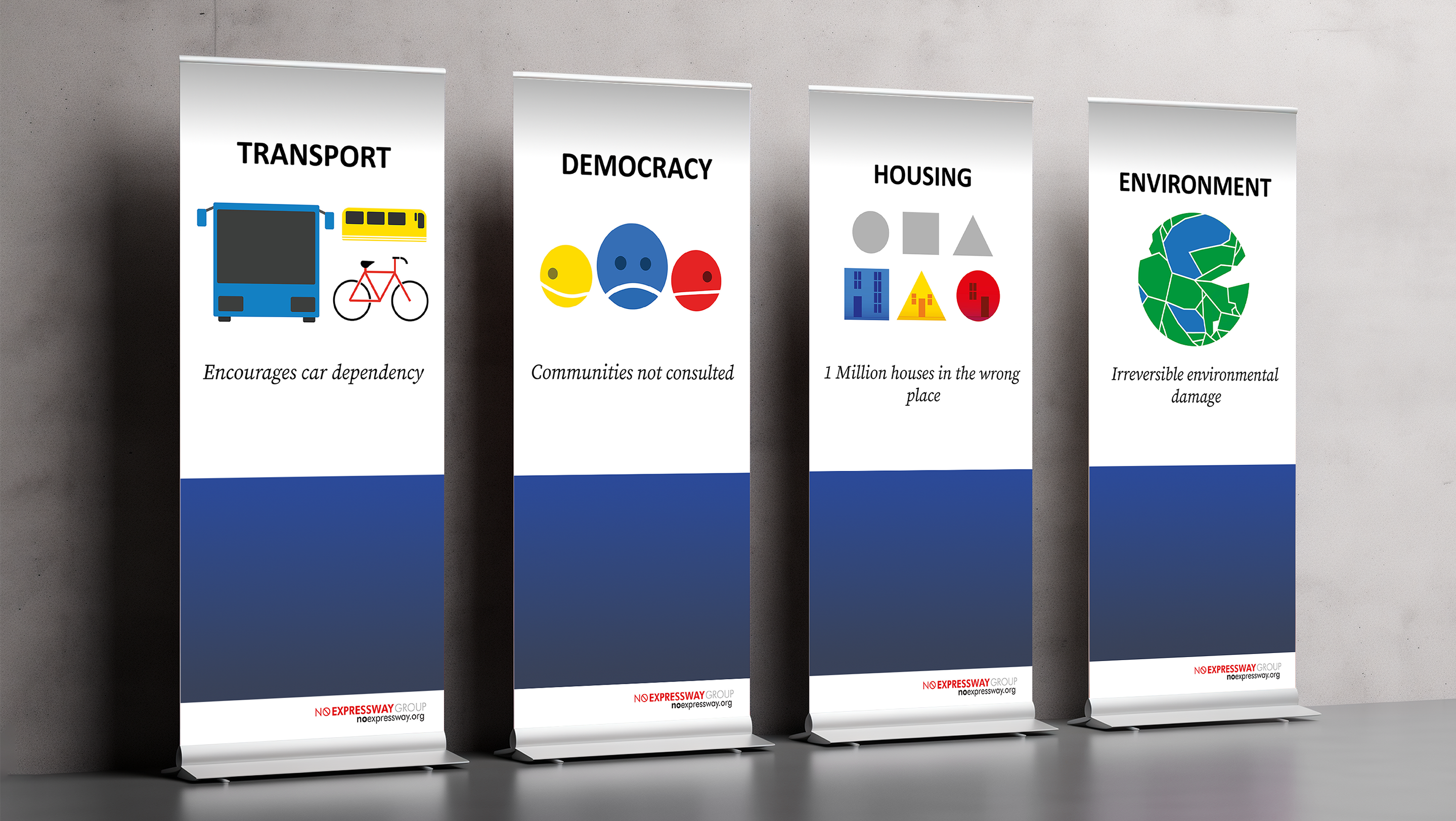
No Expressway
2025
↑
Back to Top