The project was very open-ended; the client didn't present any restrictions on style, colour, or even a name for the product. On the contrary, they were keen for me to have creative freedom.
I began the project with some very loose, painterly, explorations.

Alongside these colour explorations I began to play around with bee-related puns as a way of finding a name for the honey.
The two names that I began with were "Bee mine" and "Bee Still". Both of these are common expressions that work as a metaphor for a bee hive.
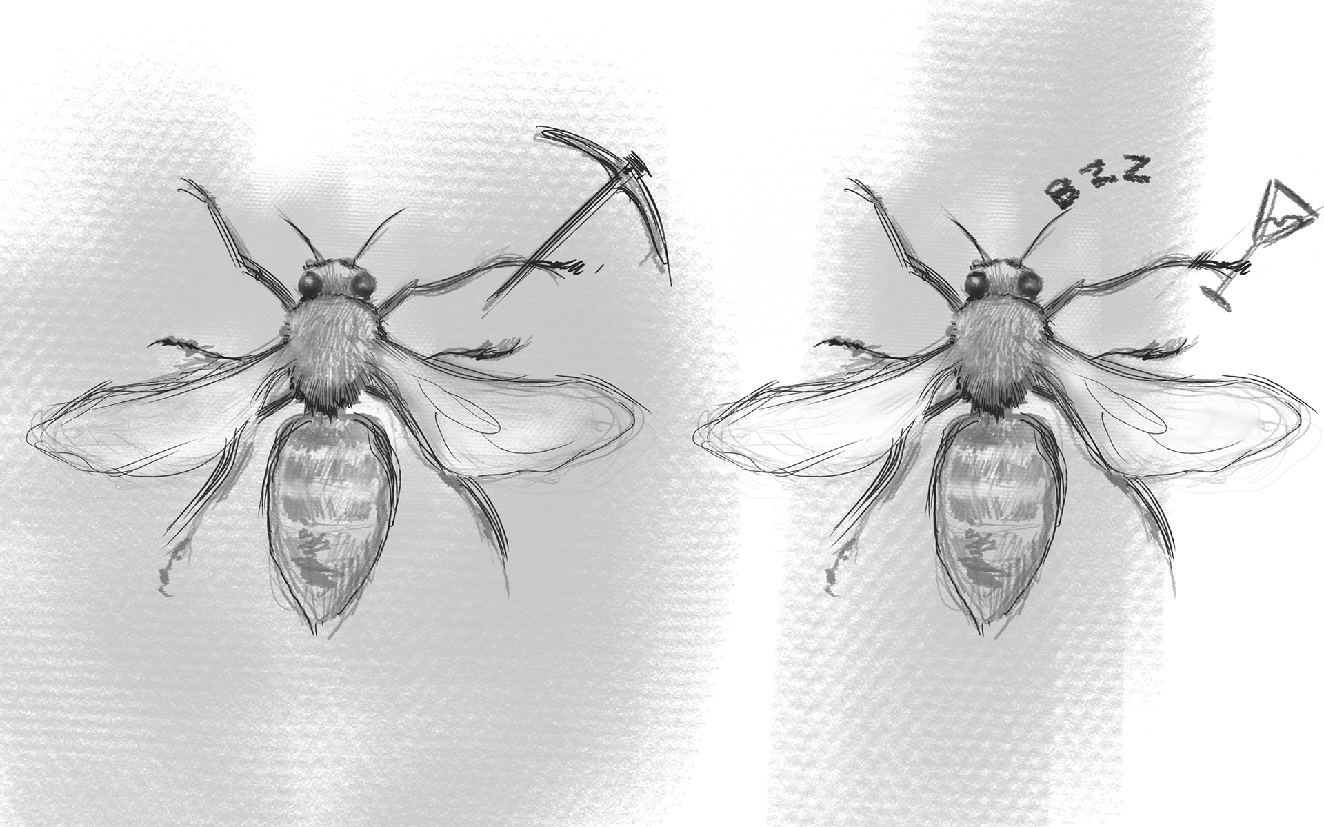
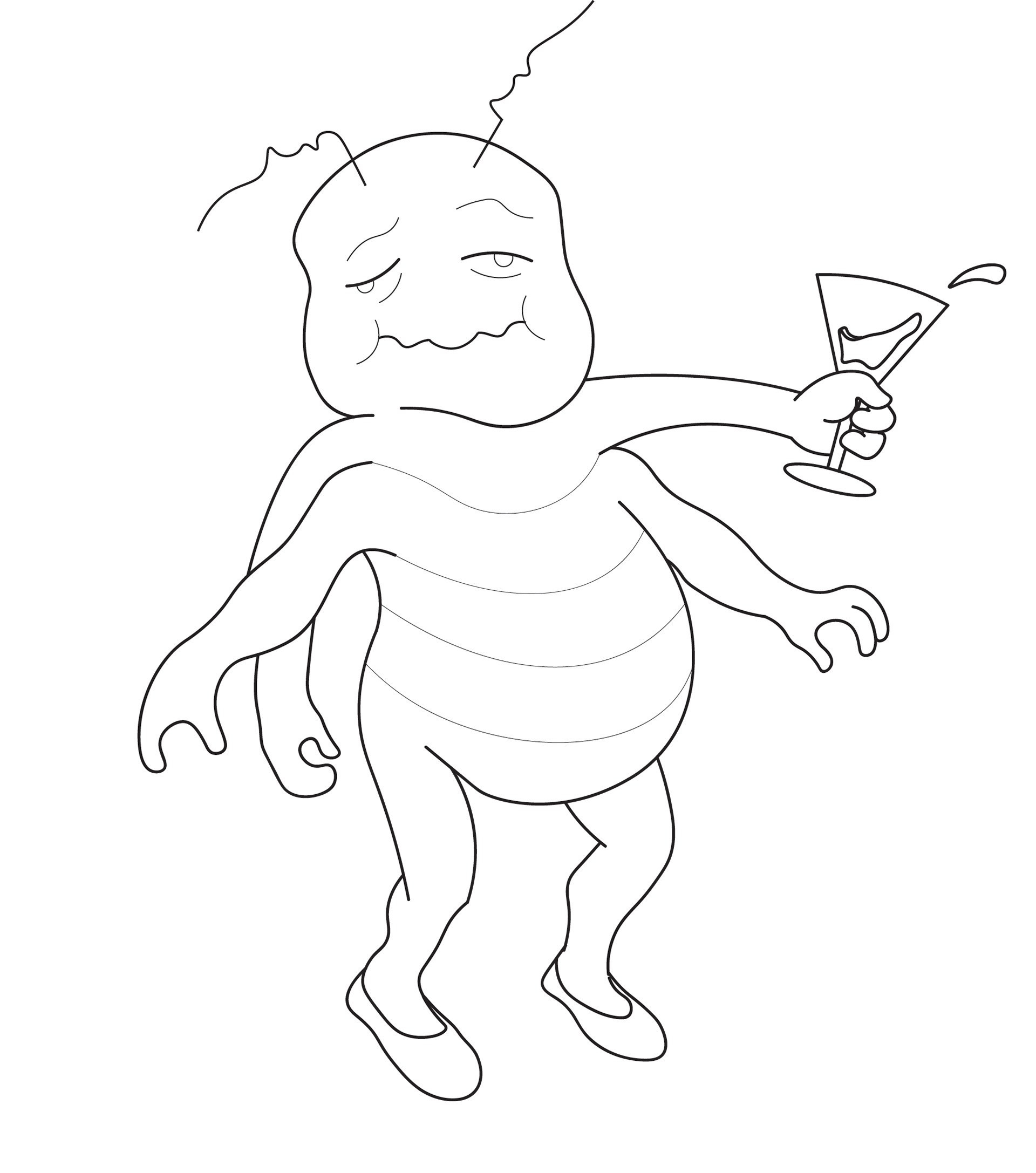
This led to an exploration of miner bees and drunk bees.

This exploration into bee puns culminated in the following :
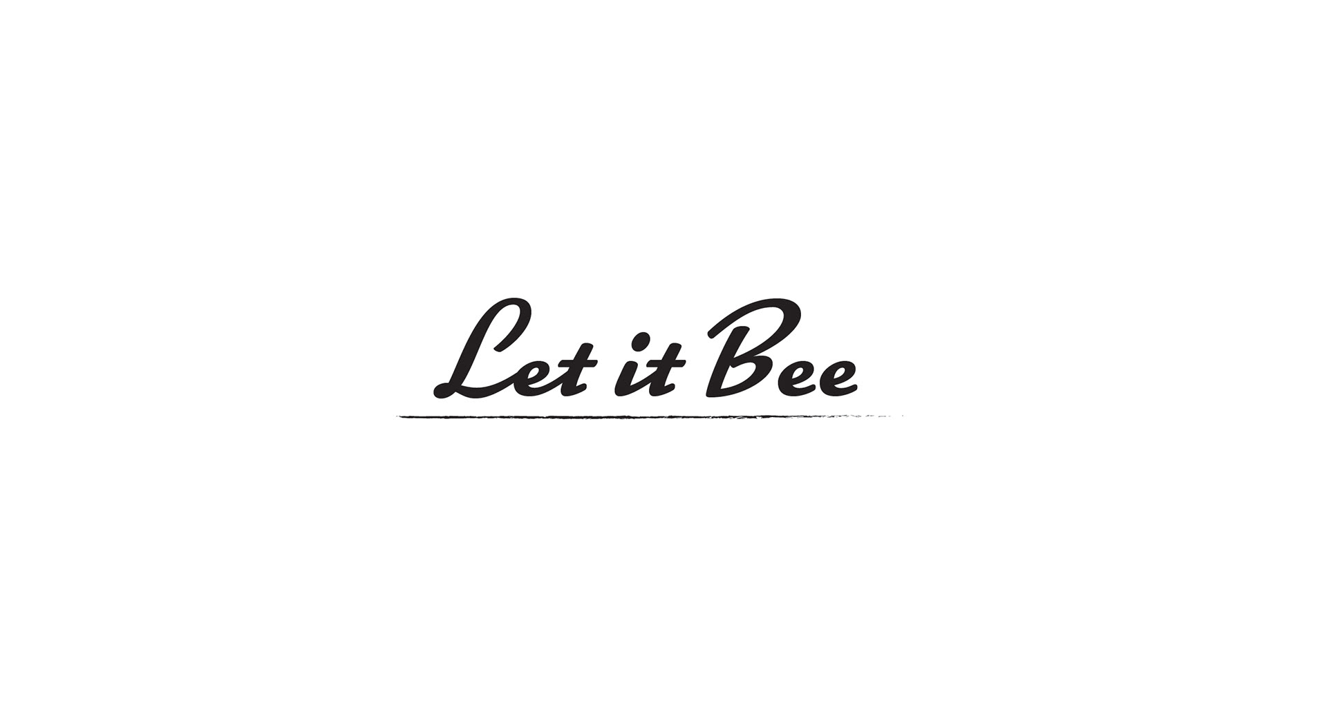
A pun on the phrase "Let it be"
The phrase itself conveys a cheerful optimism that works well for the project.
Also, the phrase makes sense in the context of conservation: leaving wild flowers to grow freely is an effective method of bee conservation.
Although I liked this approach for the reasons stated, the logo wasn't working. The pun felt too obvious and and the logo as a whole lacked interest.

Using an e as a bee.
The idea to use the letter e on its side as a bee works well visually but, more crucially, it ensures that the pun doesn't take up too much space. I found that "Let it Bee" on its own was more than a little overbearing; it felt clumsy and awkward. In contrast, using the second e as a bee, and offsetting it, allows the pun to take a back seat; there is a new visual element to draw focus and the pun is now less blatant. It is the least prominent feature of the logo.
The once obstrusive pun is now a subtle wink to the viewer.
Further, the bee makes for a well-needed, creative, visual element.
Ultimately the client approved the idea.
At this stage it was agreed that I would explore the addition of bee-friendly plants to the design in order to emphasise the conservation angle of the name.
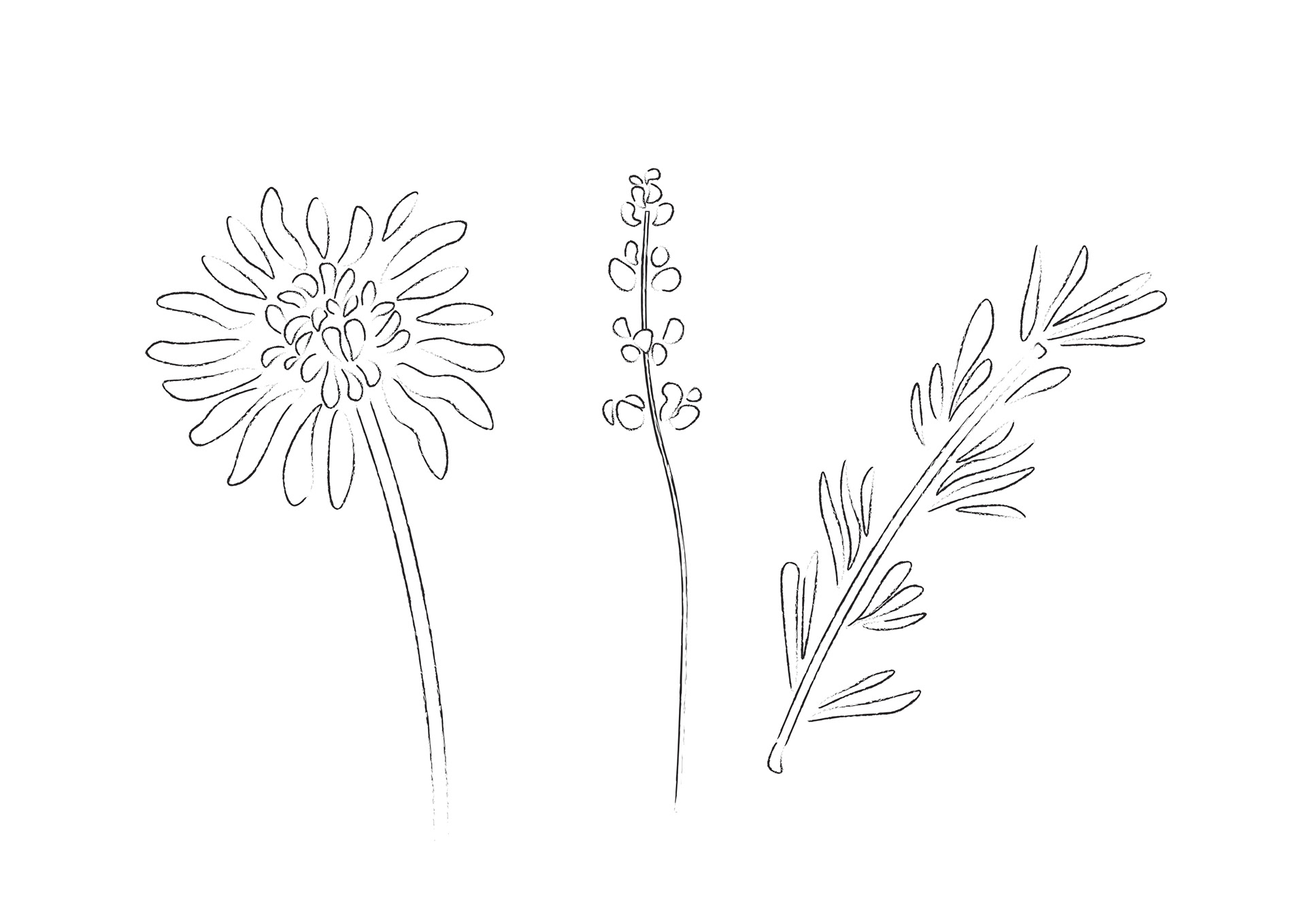
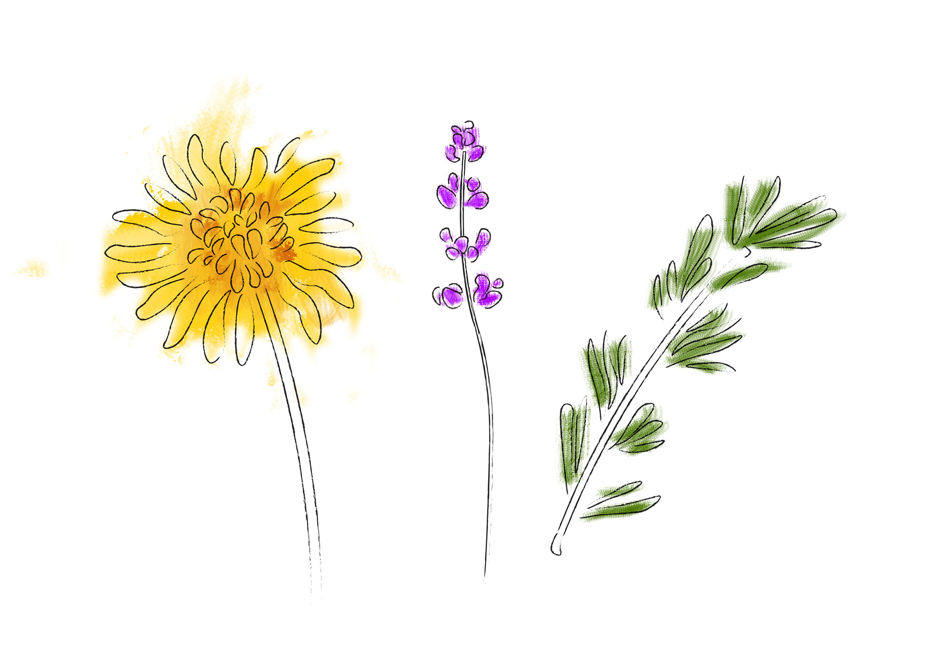
After confirming the suitable plants I illustrated them in a style that would be in keeping with the bright, positive, theme that the project had taken on.

At this stage I worked to combine the different elements and eventually landed on the final design.