I was commissioned to illustrate a scientific paper; this illustration would then feature as the cover for a journal publishing the work.
The paper introduces "A general strategy to circumvent photobleaching by replenishing fluorescent probes via transient binding of fluorogenic DNAs to complementary DNA strands". More simply, fluorescent probes, used to monitor "biomolecules of interest", are short-lived (making long-term observation difficult) and this paper presents a method to increase the longevity of these probes.
Given the specificity of the science involved, the client created the concept for the image, which I then developed and illustrated.
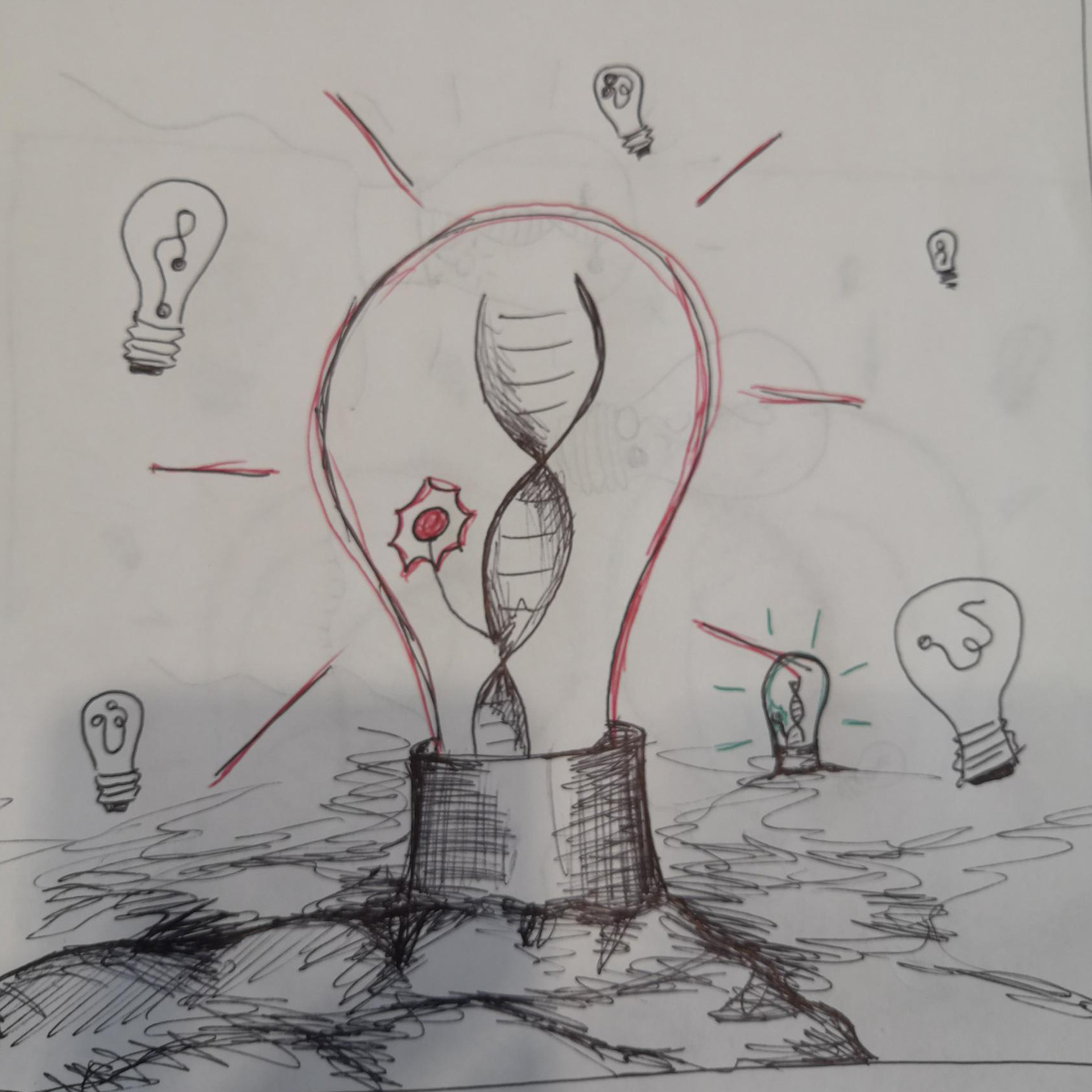
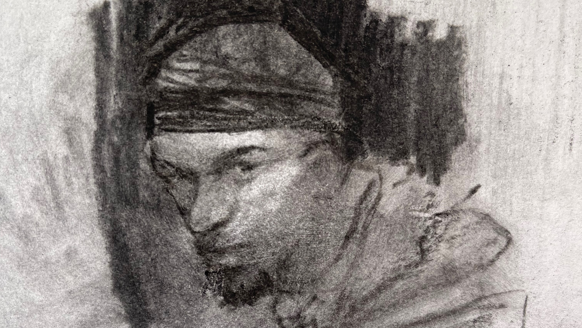
The client's concept sketches.
The idea is to represent the fluorescent probes as lightbulbs.
Using this metaphor, the dark, exhausted, probes without fluorogenic DNAs are contrasted with the replenished, bright, probes with fluorogenic DNAs.
The idea effectively illustrates the paper.

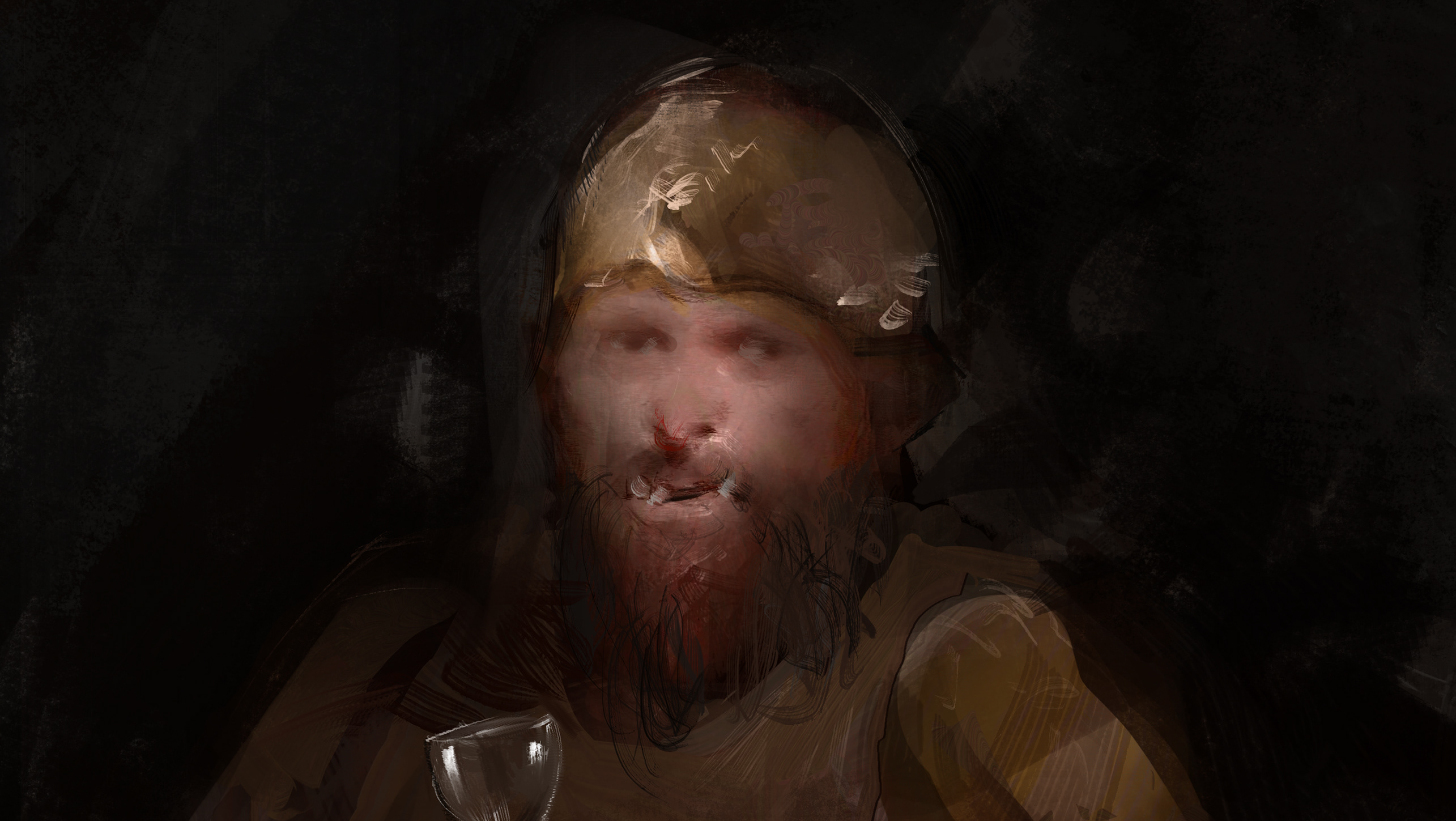
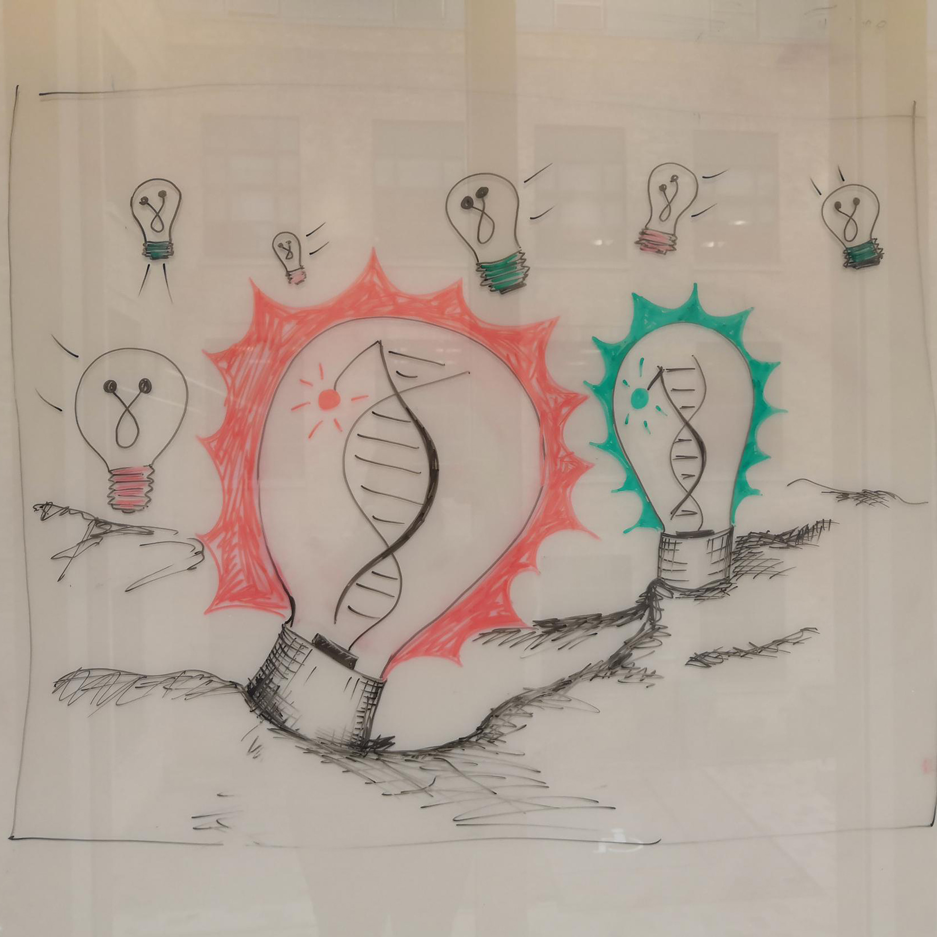
My initial sketch.
After unpacking the key elements of the client's concept I began to translate it into my own visual language.
My first priority was to create a visually appealing composition. I decided that there should be only one bright probe that acts as the main focus.
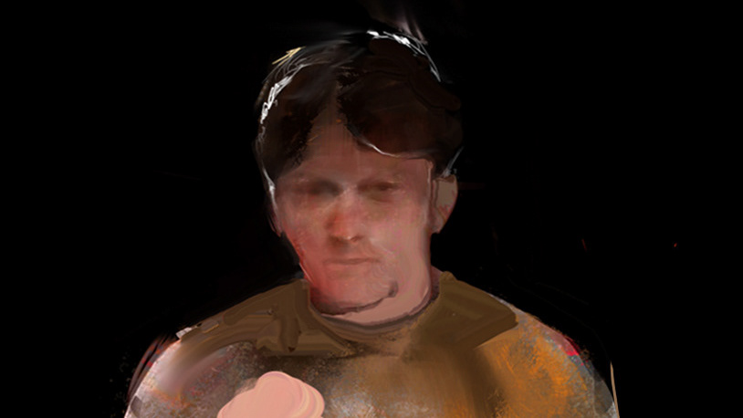
From here, I moved onto developing a colour palette.

Colour study.
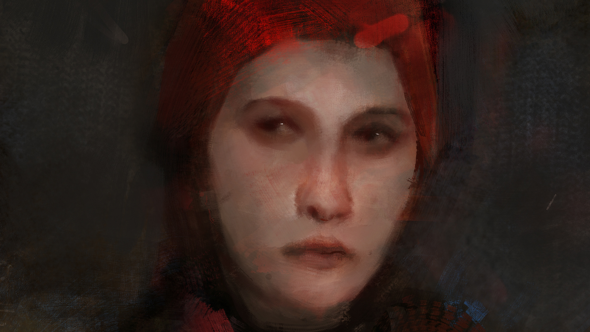
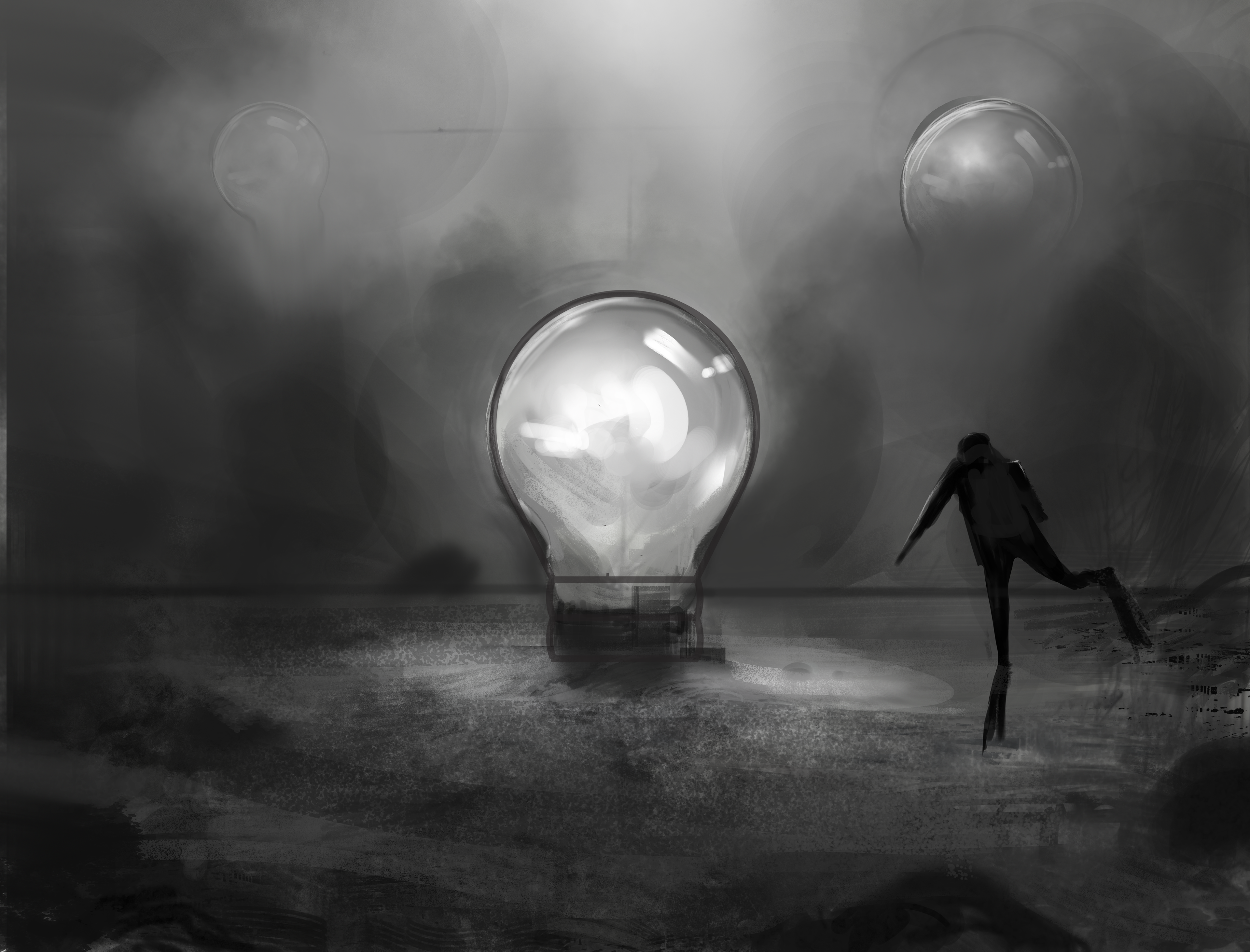
Because these studies take place in solution we eventually decided to set the illustration underwater.
This aquatic theming interfaces well with the lightbulb idea; the surrounding murky depths augment the contrast between bright lightbulb and dull.
To realise this idea, I used dark blues and greens for the water and contrasted that with a bright yellow for the lightbulb.
Alternative concept.
After we decided on an aquatic themeing I developed a more literal version that incoporates a diver.
The client was undecided as to whether they wanted to use this version so they had me colour it to assist in making a decision.
Alternative concept coloured.
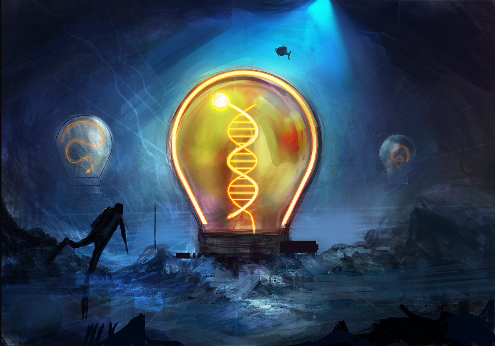
After discussing the issue we decided against using the diver; it ultimately drew focus from the central metaphor and complicated an already complex illustration.
The vibrant, high-contrast, colour palette that I used here felt too strong for the piece and I would tone it down for the final illustration.
Final illustration first pass.
The colours are generally more muted but the orange in the bright bulb retains the vibrancy from my previous colour explorations. This creates a contrast that leads the eye to the bulb and reinforces the central metaphor.
I decided to push this contrast further.
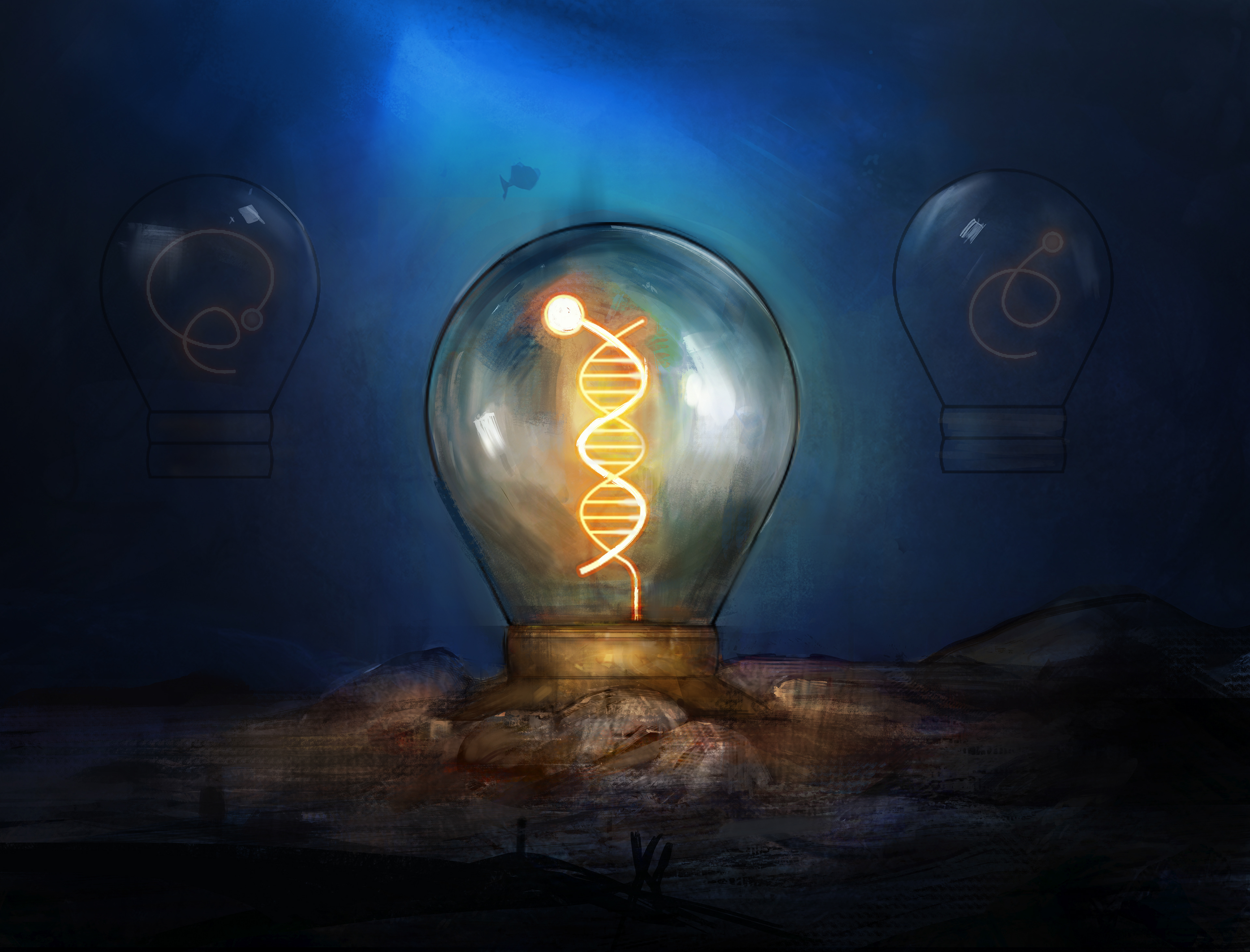
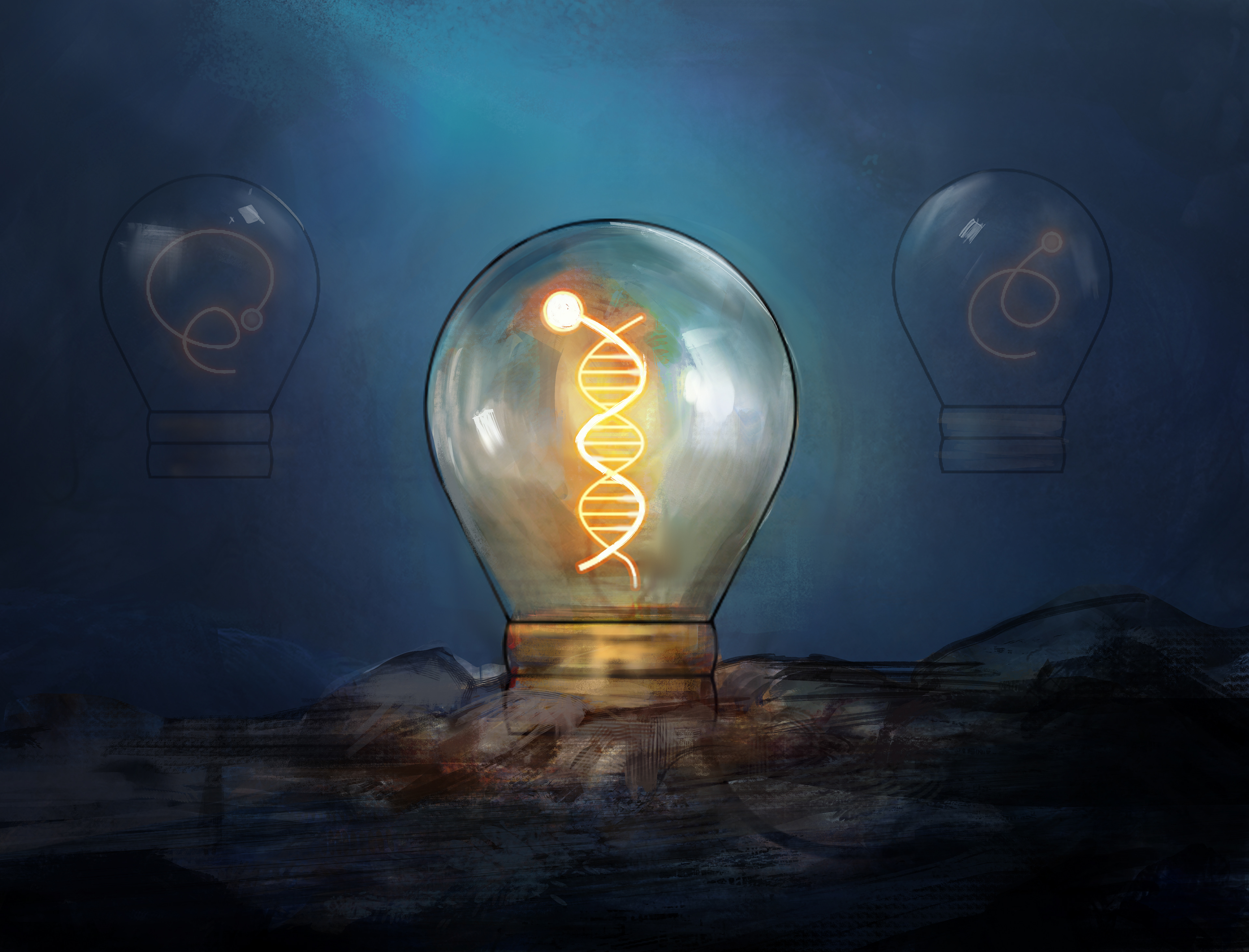
Final Illustration.
I increased the contrast in the image and introduced some playful references to the aquatic themeing of the illustration.